How To Do It Like We Do
Everybody loves a good Before-And-After, right? A good transformation is magical.
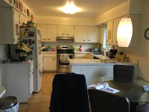
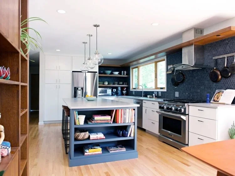
Before
After (photo by Gina Rogers)
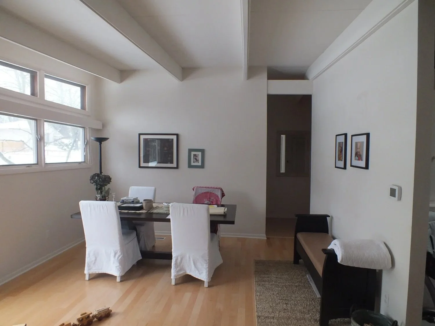
Before
After (photo by Gina Rogers)
Let’s be real, though: we all know it’s not magic. Any transformation worth your drool takes some investment, of both time and money. But it takes more than that. One might argue that you need innate taste and artistic inclination, but even still, I would counter that there are tools and tricks of the trade that even the most artistic among us use to visualize changes before we ever rattle off credit card numbers—even for relatively small updates and purchases. So, if you’re a Taste Guru disguised most days as a Normal Human Drinking Coffee, and you have some ideas but can’t quite convince your partner (or even yourself) that it’s Buy Time, look no further than this post.
How To Do It Like We Do It
First, get a Mac and an Internet Connection and open up Keynote. (This activity is pandemic friendly! Doable in isolation!) I’m sure you can do what we do in any number of programs (PowerPoint, Google Slides), to be honest, on a variety of platforms, but I’m going to tell you how to do it with a Mac because I’m a One Trick Pony. Also, because it’s so easy in Keynote that my 10 year old does it.
Now, take a Before Picture. This is not just for your personal satisfaction later—though it could serve that purpose. (For that, you can leave everything in your space; honestly, the worse the contents now, the better the After effect later.) But for this, remove anything you plan to replace so you just have as blanche a carte as possible.
Behold, my screened porch. We built it on to the back of our house over a decade ago, so we could enjoy our little slice of green space without being eaten alive by Hoosier Mosquitos, who are ruthless and apparently have large family gatherings in my backyard with potlucks that last all summer. Furnished with an iron hand-me-down table and chairs and a loved-to-the-point-of-fraying-and-molding hammock swing, it has been a welcoming enough space for family and friends over the years. The heat lamp has made it possible for my husband, Brian, and his friends to watch soccer year-round out here, buffering their cries of victory and defeat from children sleeping inside the house (though I can’t say the same for the neighbors).
The heat lamp stays (though not necessarily where it is), as do the storage benches, custom built by our friend and builder years ago, and very useful.
God knows I’ve stood right where I’m taking this picture many times, envisioning what I wanted from this space. But even if I had a cocktail in my hand, it’s hard to visualize all the bits and pieces; and even if I could do that, I could hardly remember it the next day, let alone sell it to Brian, who hears “how about a rattan chair” and is thinking about Stratomatic. (He’s a middle aged baseball nerd, what can I say.)
So, take your cocktail to your computer instead, open up a new Basic White Presentation in Keynote, and delete all the default text boxes. Drag your backdrop photo on to the page. Voila, you have a palette.
Now you shop! This exercise assumes a few things. 1) You have already determined the use and function of the pieces you’re looking for. 2) You have measured and created a floor plan, so you know how big your various elements can be. 3) You have an idea for the scheme and aesthetic direction and/or have laid the groundwork already by looking at lots of images of rooms and finding several you love, to use as your primary inspiration. In my case, after years of debate, we decided last year that we wanted a combination of dining and lounge space. I knew I’d be mauled by my children and their friends if I took away the beloved hammock swing. I knew Brian would thumbs down any light fabric, because there’s about a 30% chance we will take this stuff inside in the off season, and we are excellent trashers of furniture around here.
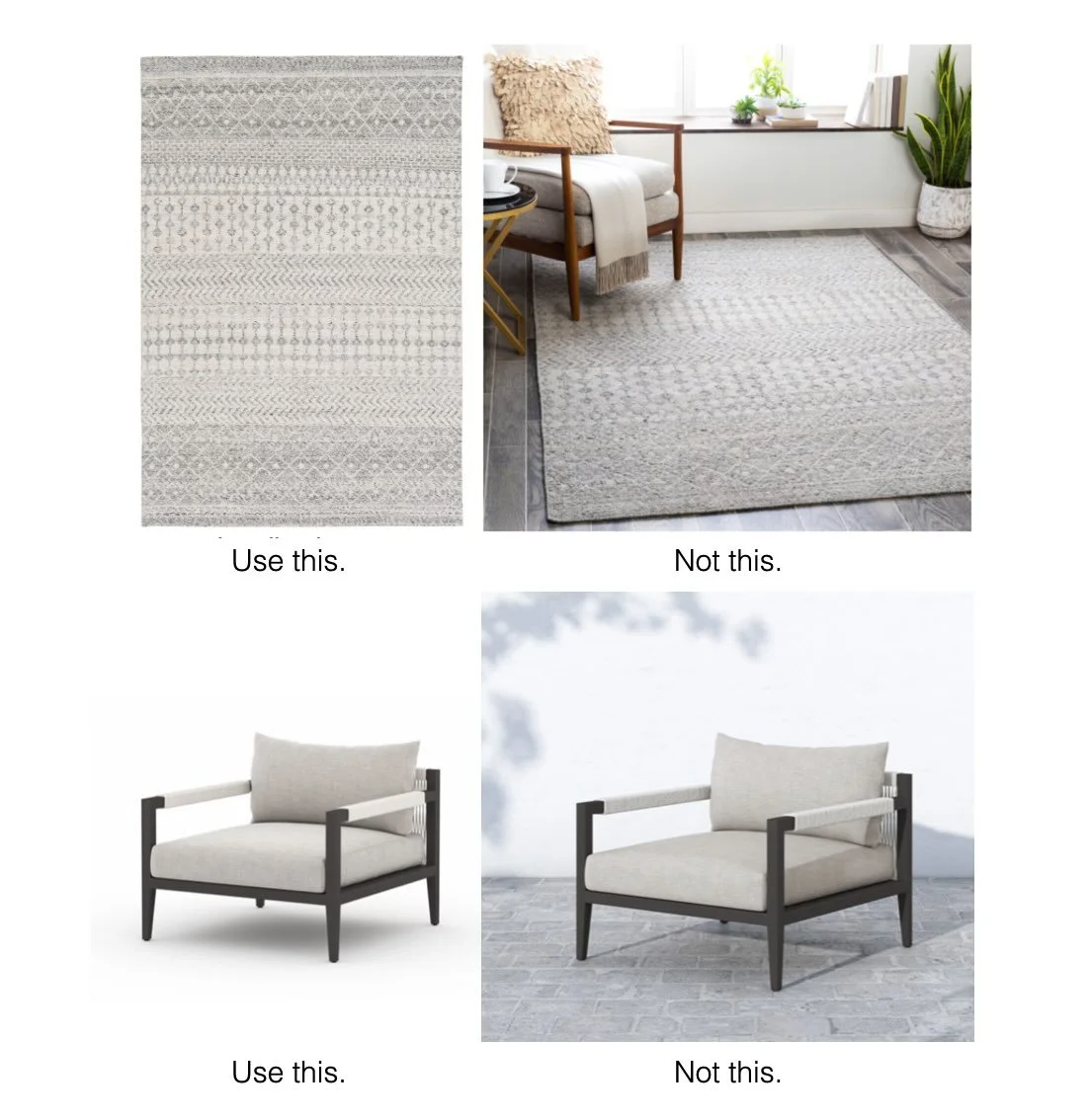
Take screen shots of possible products to fill your space. Try to find images of pieces in isolation, with solid, high contrast backgrounds, and oriented the way you would see it in your space. Rugs are tricky, but you can usually find images of them flat; use those, not the images shown in a space (unless it is handily shown in the right orientation for your space).
Products shown are the Azalea and Sherwood Outdoor Chair
Drag the furniture screen shots into your keynote presentation. Now, click on one, select the Image tab in the upper right, and use the Instant Alpha tool to make the background transparent behind the piece. Do that for all the various screen shots you want to try out. Now you can drag various options around in your background, to see how they work together.
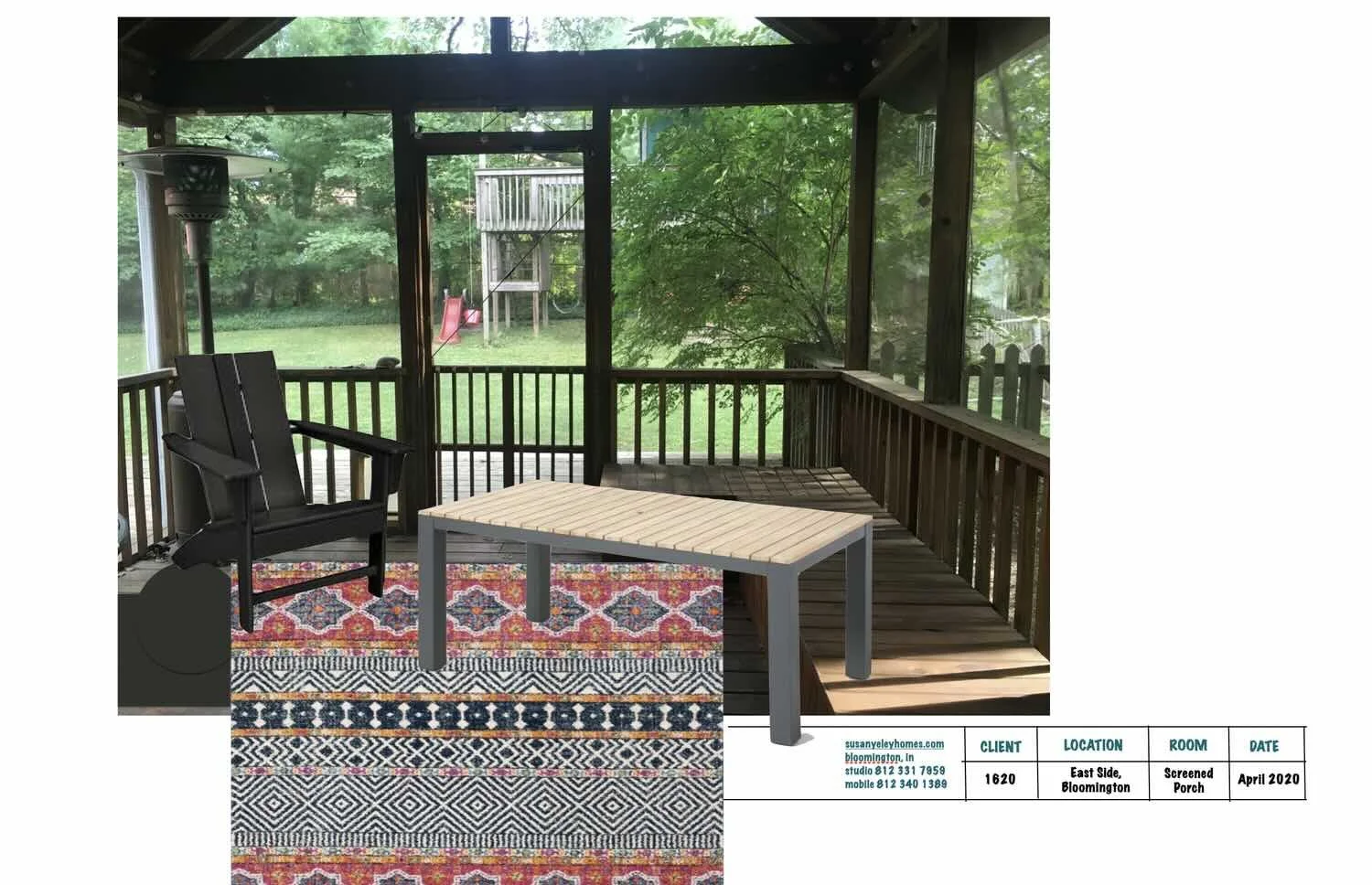
Here, the table slats replicate the benches too much, so it’s a No. The rug is cool. The black adirondack may not be cozy enough, considering it’s our only really comfortable element here that’s not a hammock (which our parents won’t be sitting in). It also kinda gets lost in that corner, with the porch slats behind it.
Try some of these other useful tools:
In the Arrange tab, move pieces forward and back to show which elements are in the foreground and to place a table on a rug instead of a rug on a table.
Also in Arrange, you can flip left to right, so if your chair image only shows the left view, you can make it angle right instead.
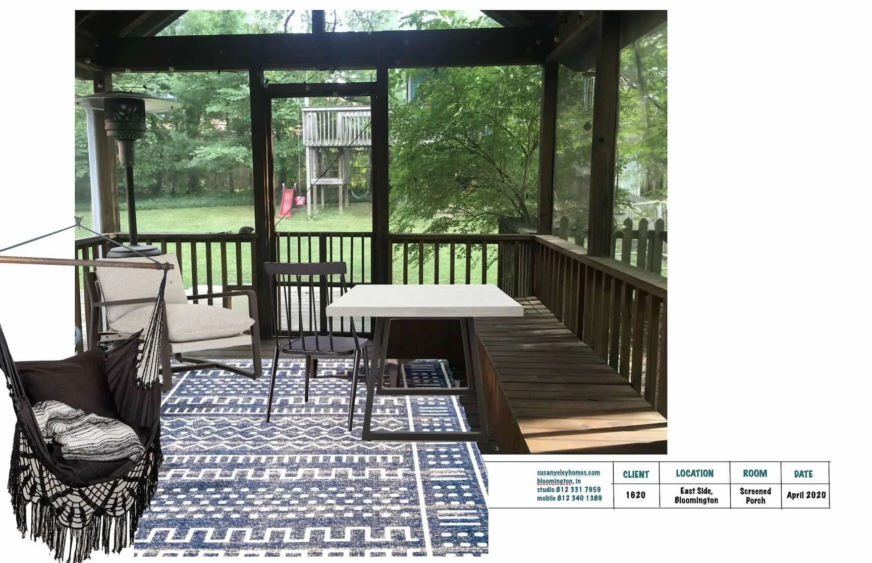
This is me trying some lighter options, but knowing Brian is going to nix them. I can’t imagine he’ll like the pricetag on that corner chair either. Here, I like the simplified palette, with a lot of the color coming from the green surroundings rather than the pieces inside the porch. Meanwhile all the open arms and backs are competing with the rails in the porch structure. Some of them have to go.
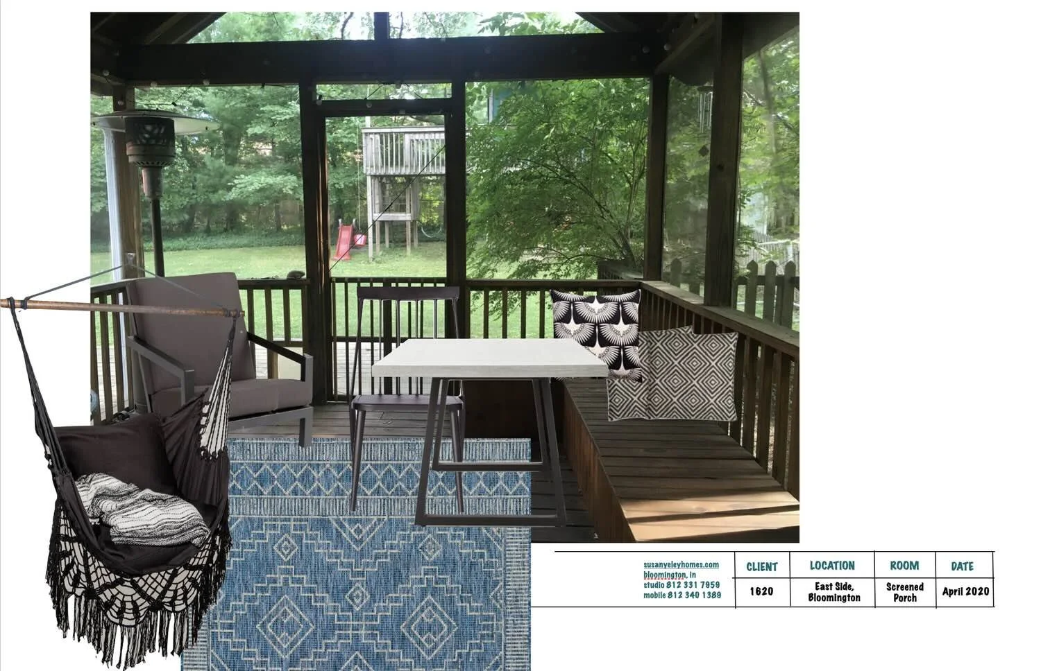
The gray chair isn’t much better than the black — and is kinda boring to boot. I love the dining chairs, but can’t handle them with the rails behind. There’s way too much going on with the crewel work on the hammock and the pattern on the rug and pillows.
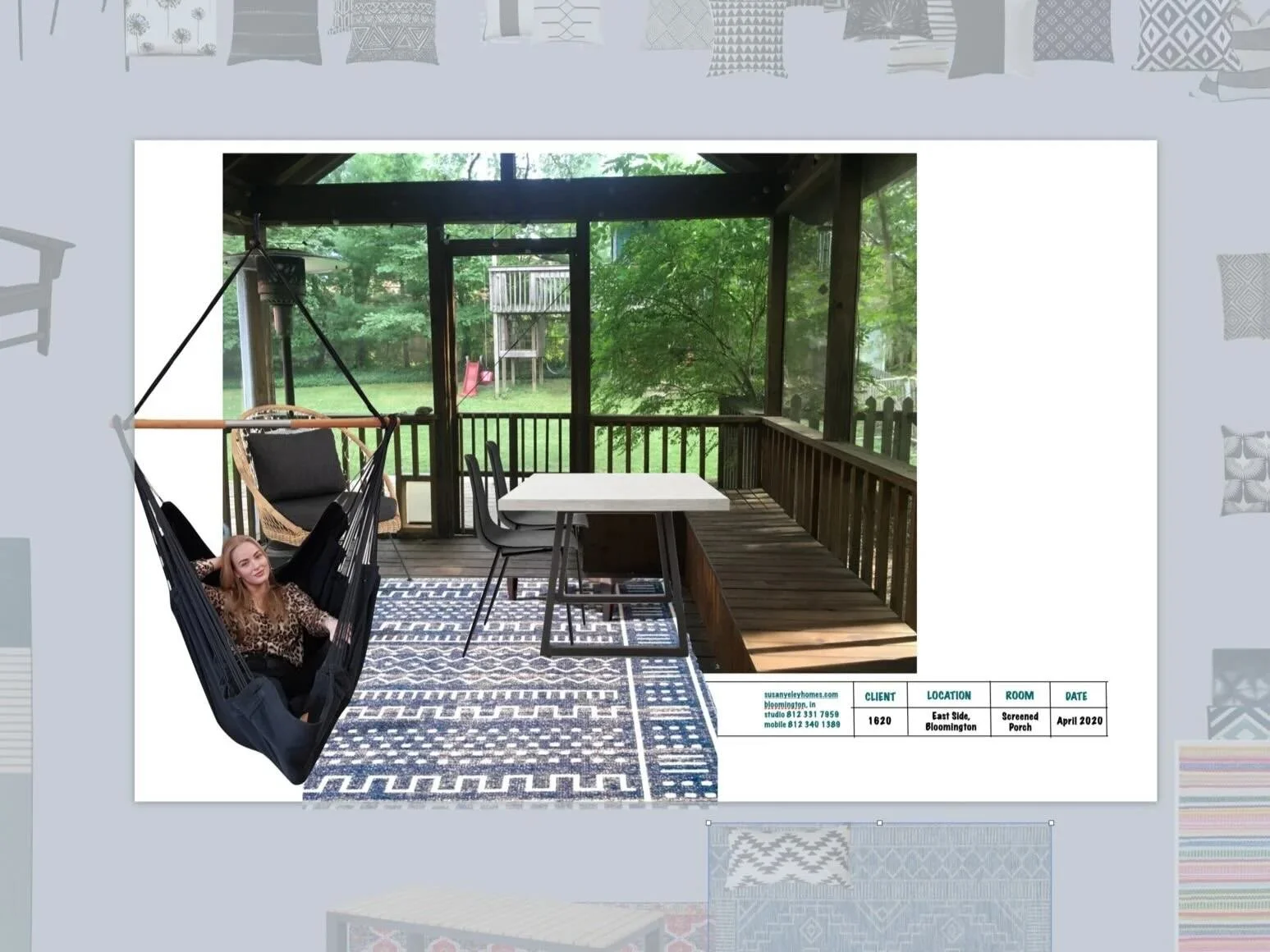
Lots of options later (some in this view off to the edges), WE HAVE A WINNER! Just need to figure out the throw pillows…
Now, friends, you’ve created what we call an IMAGE BOARD! It will sell a design to anyone, because you can say with confidence, “this is going to be beautiful.”
As for me and my screen porch, here it is! The completed space.
Dining table: Four Hands Cyrus / Dining chairs: Article Svelti / Rug: NuLoom Tribal Cora / Hanging chair: Etsy / Pillows: Etsy / Rattan chair: Article Aeri
PS - In case you’re interested, here is my 10-year-old’s vision of her bedroom. See, you can do this! (We call it “remote learning” around here these days…)

