1950s Tiny Ranch Reno, Part I: The Mullet
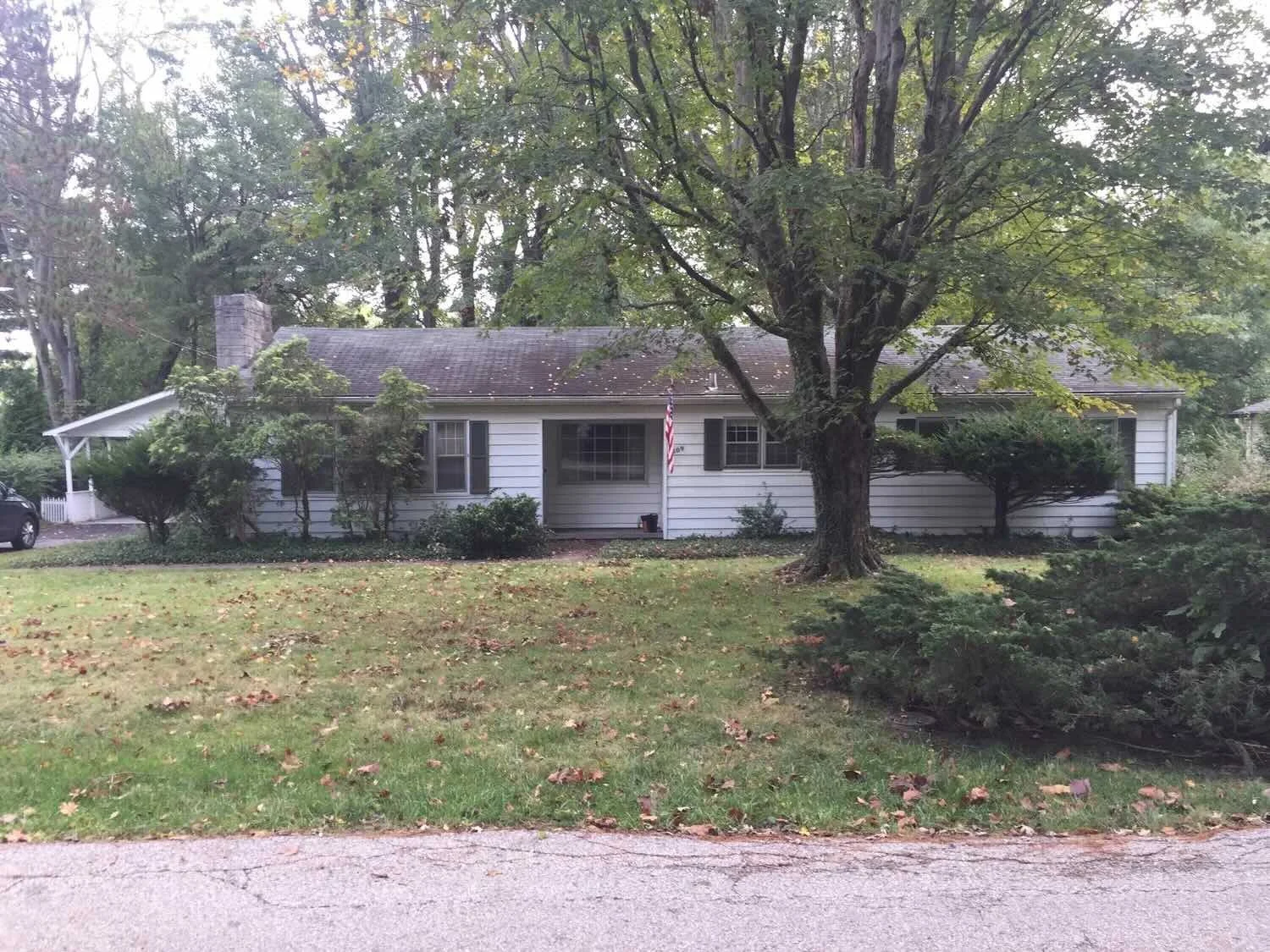
Here’s what this house said to us when we first met it: “Pile in the wagon, kids! Time to head to Grandma’s for Thanksgiving!”
Ah, the quintessential 1950s ranch.
Actually, Grandma warned us not to judge a book by its cover, and in fact, this house is a touch different on the inside than the norm. Looking at it, you assume a standard ranch layout: living and eat-in-kitchen on the left, 3 bedrooms and maybe 1.5 to 2 bathrooms on the right. Maybe a basement—but a wet one, if any. Most basements are, here in limestoney Bloomington.
It’s cute, right?
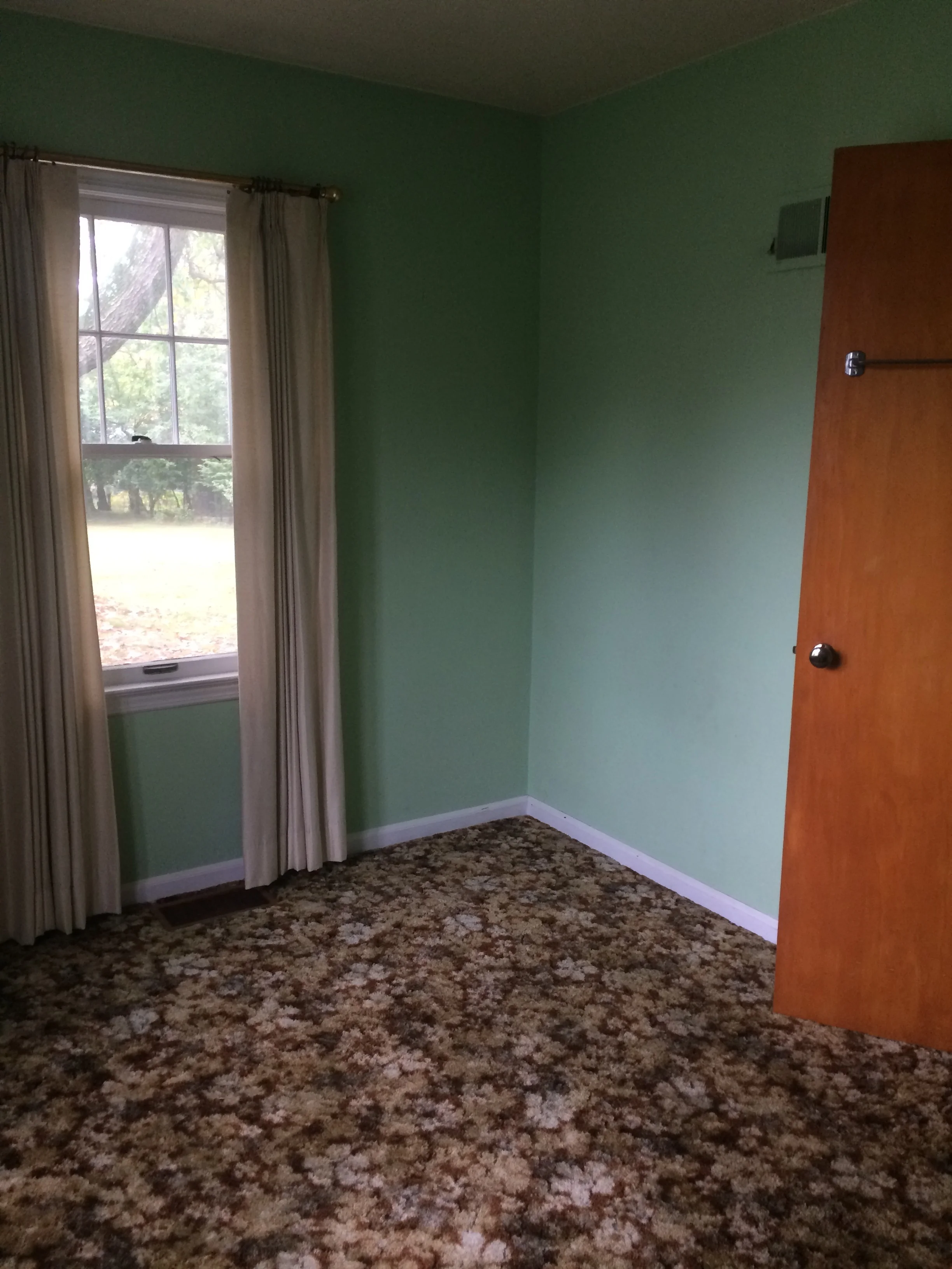
When this house went on the market back in 2017, the SYI team saw it with clients who were interested in renovating a small, straightforward home for resale. The inside was charmingly original — which always feels so much better to tear out, than something newish that you just don’t like. The plush carpeting! The old school appliances! Grandma, we do miss those holidays at your house.
The structure seemed sound, but the layout, though customized from the standard ranch, was not conducive to a modern, connected lifestyle.
For a 1500 square foot home, the main bedroom was kinda huge and - luxury for a 1950s build - had an ensuite bath and killer walk-in closet.
Conclusion: The whole interior needed gutting and reconfiguring. While that may have been feasible for owners looking to buy, renovate and live in the house, 1500 square feet, even fully renovated, would be hard to resale for profit. We deemed that for this house to be a good investment, you’d have to go big, or go home. Our clients didn’t have that kind of up front capital.
Enter our good friends at Loren Wood Builders. A couple days and a few voicemails back and forth, and voilà! They owned the property, and we were digging out our tapes and pencils. The process to reenvision this gem for the 21st century was underway.
Our goal was to make the house bigger. It needed a garage, a modern kitchen, a mudroom and more storage. Three bedrooms and 2 1/2 baths, minimally. We entertained the thought of a second story or enlarged, more square single-story footprint.
The whole team (SYI & LWB) felt the structure could and should stay, however, which would save a lot in reno costs. We wanted to respect the neighborhood, which is filled with these little ranches, not to mention the house’s own history. AND, we well knew ranch-life (one-level living, not cowboys) is the best life, sought after by people of all ages. So, the solution emerged: keep the original footprint, and add an L off the back.
We toyed with several options, as we always do, trying to figure out flow and how to maximize living and storage space. The budget didn’t allow for a basement - which is okay! Water in basements is more common than not in Bloomington, so it’s not a bad idea to avoid that problem all together.
Swedes have a word that means “just the right amount”: lagom. (What is it with Scandinavians being so wise and progressive?) It is a guiding philosophy for us at SYI, and especially applied in this renovation: part of the soul and history of this house was about living in just the right amount of space. Super sizing wasn’t a thing in 1950s America.
We asked you folks to weigh in, remember? A home with no buyer is both easier and harder to design; and to fetch that elusive buyer, we wanted a layout that appealed to the masses. In the end, we settled on a design that put all public space in the back of the home, the new part that extends into the property’s expansive backyard. Bedrooms are small - four of them plus a den, atypically located in the front of the house, all in the original 1500 square foot footprint. Lagom is behind that choice: conserve space in the rooms where you spend most of your time with your eyes shut. Put money and square footage toward the spaces where you spend more of your time with your eyes open.
In the studio, we started calling this project the mullet ranch—business up front, party in the back. You can see it below in the elevations. The front is pretty modest, respecting the existing low-profile architecture street-side. It’s very Hoosier of us to keep appearances modest, we think. But get around to the back, and surprise! lofted ceilings and walls of windows. Gorgeous.
Concurrent with the architectural direction, we were developing the interior aesthetic. (That’s why you want a firm that has an interior designer AND an architect on your team, friends.) We wanted to give this mystery buyer a clean, elegant backdrop for whatever they would bring into the space. Simplification became our motto: black, white and wood.
Here are some of our inspiration boards.
With layout and direction determined, we specified particular materials and created image boards to see them in context.
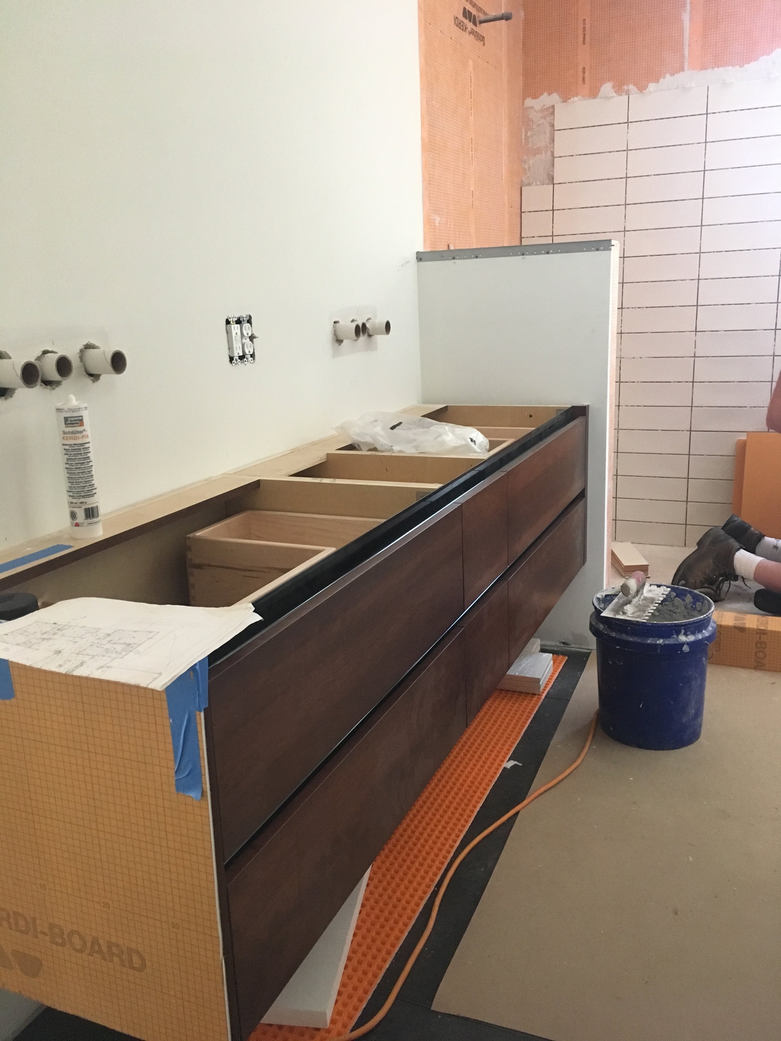
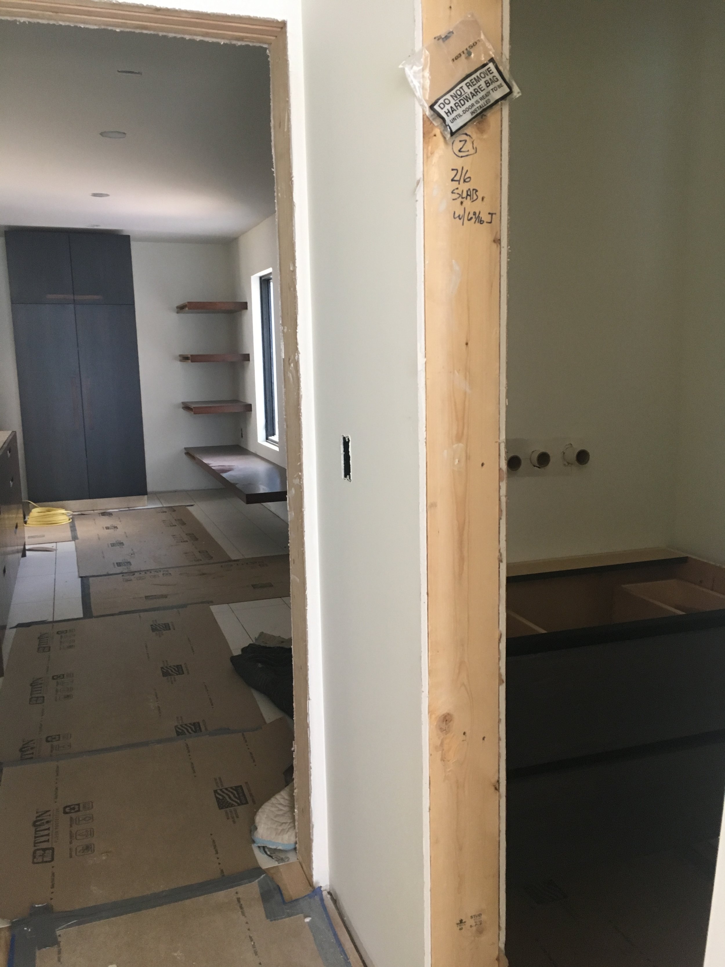
Finally, in winter, LWB broke ground, and framing began. Six months later, the home was just about finished. Nine months later, it hit the market.
Stay turned for Part II.
Ooh! The suspense!


