1950s Tiny Ranch Reno, Part II: Why We Dig Virtual Staging
Hey! You made it to part II! Gold star for you. We know. The suspense has been killing you.
Wait no more…
After Photos of the Mullet Ranch
Low profile and ever so modestly modern, this house has curb appeal for days. Remember that the private spaces are up front, occupying the home’s original 1500 square feet? The ensuite bedroom (that’s gender neutral for “master” bedroom) is actually the most exposed, right on the front corner, by the driveway and the path to the front door. You may ask why in the world we did such a thing?
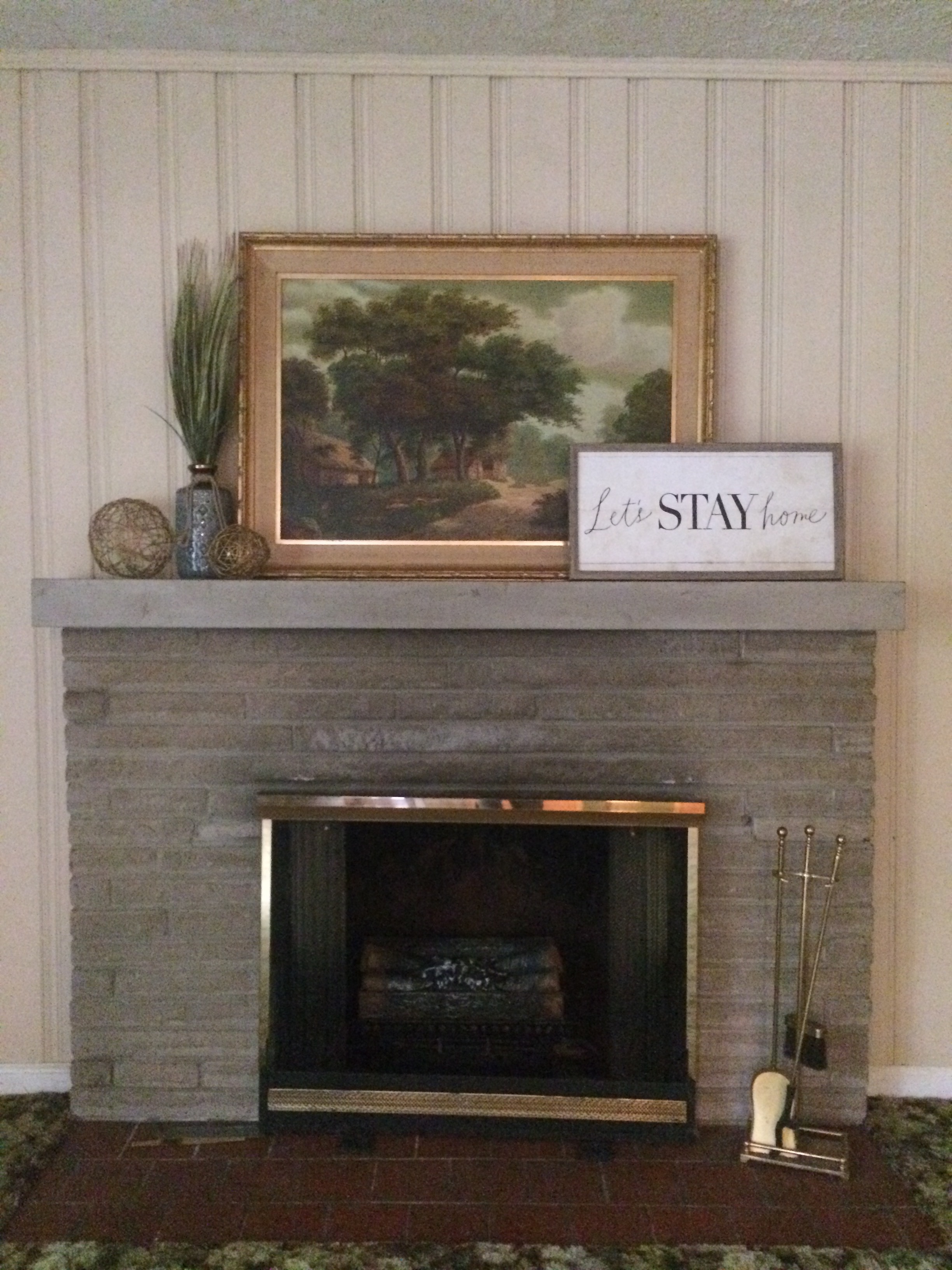
Look back at the original photos and you will know: there was a limestone fireplace in this corner in the original living room. Hoping to preserve it, we designed around it; the space wasn’t large enough for the new open living area, so we gave our lucky mystery owners a limestone fireplace in their private suite. To shield the room from the world, we added the screen (for which Loren Wood Builders scored reclaimed pickled redwood!), and because we are interior designers here as well as architects—we made the interior window trim plenty deep to mount shades. Unfortunately, renos being renos, the fireplace proved unsalvageable. But that screen! We drool every time we drive by.
Other things to note: nobody likes original squatty 1950s windows (at least nobody at SYI), so we elongated them to counter the “squattiness” inherent to a ranch, and of course to add more interior light. And hey! it’s 2019. Time to ditch the old carport and attach a garage. The middle of the last century was great, but we say: attached garages and bigger windows for the win!
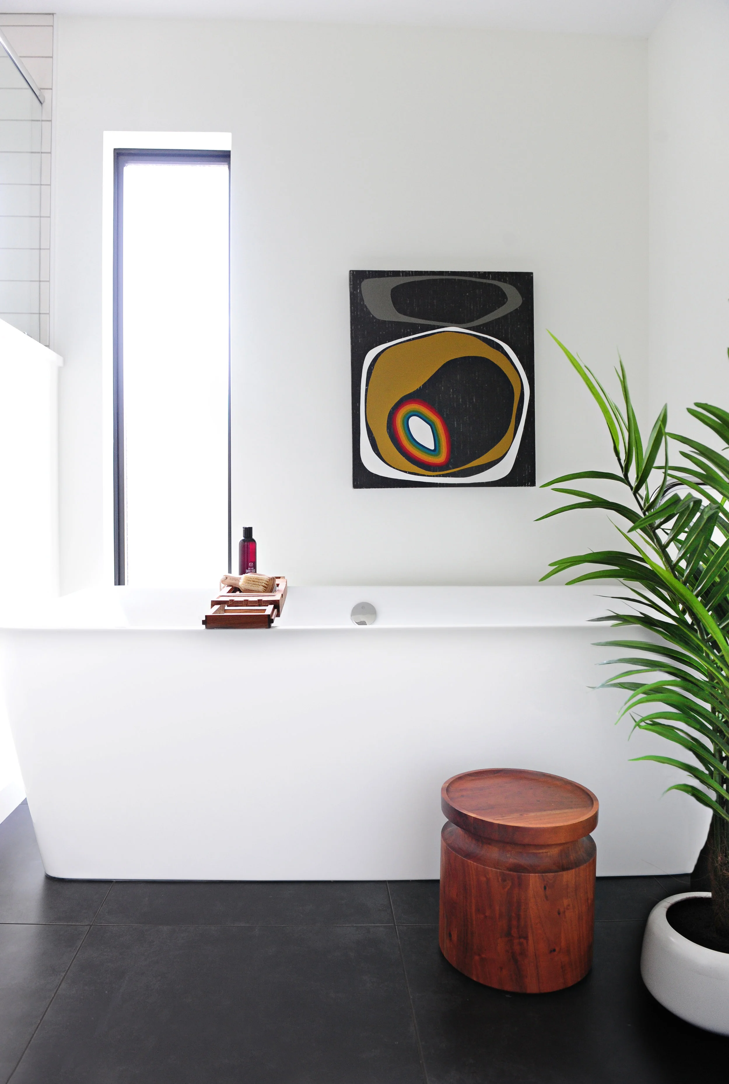
Of course we are going to show you the inside! ‘Tis indeed a gift to be simple: when in doubt, friends, black, white, and wood. Enough said. Art in the ensuite bath, above, by our e-friend Tammy Love from Michigan. Follow her on instagram @modernartrocks. You will want to buy her work.
The other three bathrooms (two full and one powder, above) follow suit with consistent materials throughout. Nothing crazy, just a whole lot of elegant simplicity.
“I want to be a hoarder but not look like one,” you told us. Above, the dreamiest laundry and mud room we ever did meet, with extra deep storage for…. your vacuum! your camp chairs! your nieces and nephews playing hide and seek! Remember, this house has no basement, so we needed to make sure there were ample nooks and crannies in which to stash the not-so-pretty stuff of life.
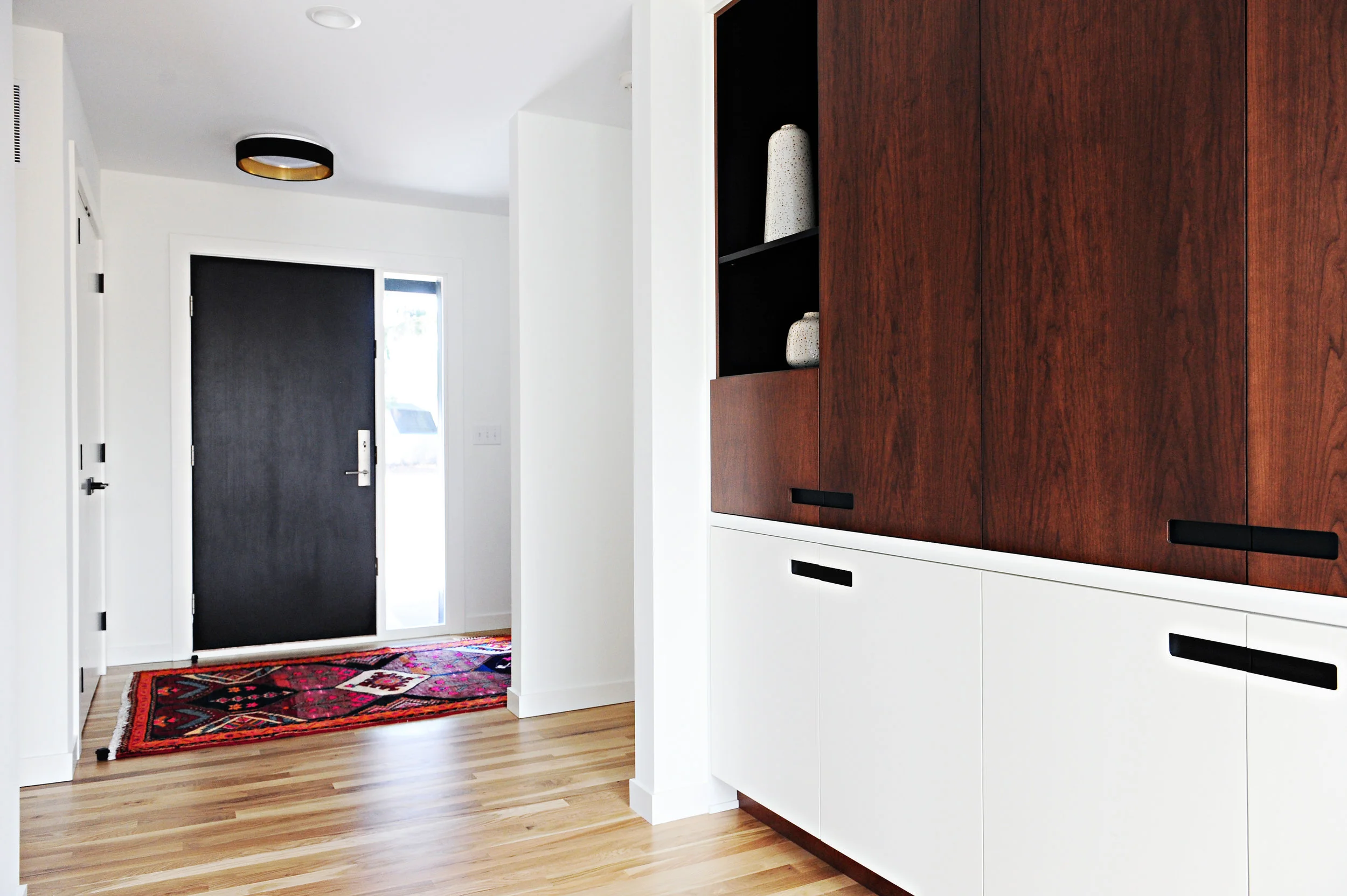
The foyer and front hall offer yet more beauty and function. Oh the things you can hide in this luscious built-in. There is also extra storage in the garage. And if you really want more storage, there’s a bonus room with its own exterior entrance in the back. We dubbed that the “flexi-space:” perfect for crafts or media or music or yoga—or an extra home office that clients can enter directly. See? It’s fun to design for the Every Person.
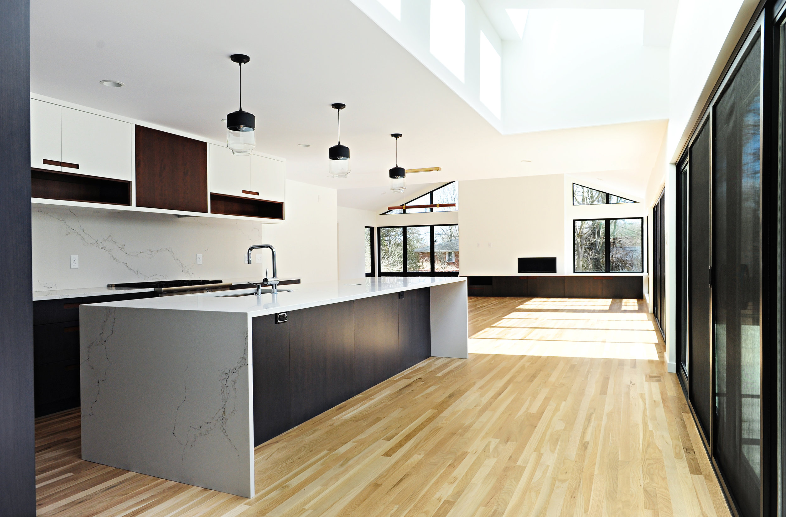
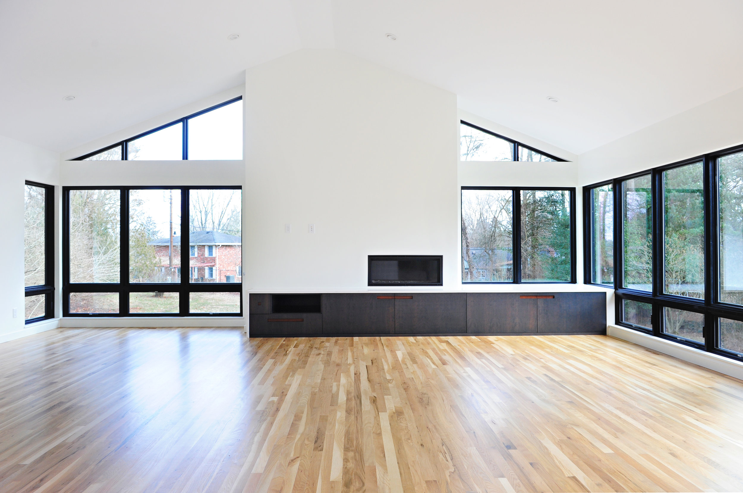
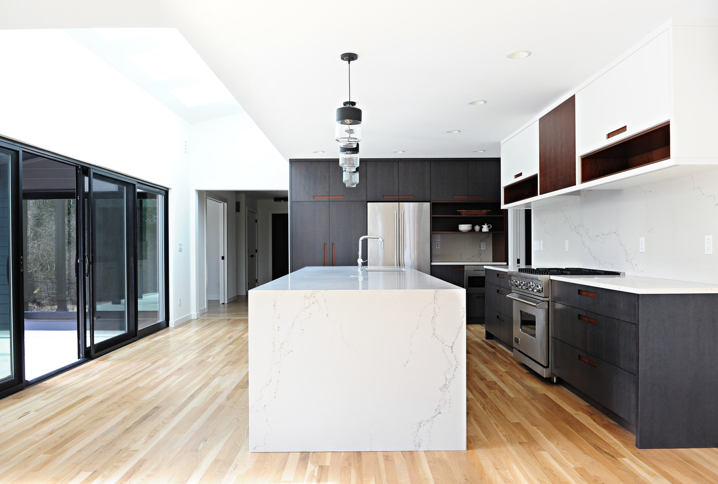
It’s all gorgeous, don’t you agree? But we’ve buried the lead. We still have to show the very best part. This is, if we do say so ourselves, One Really Great Great Room.
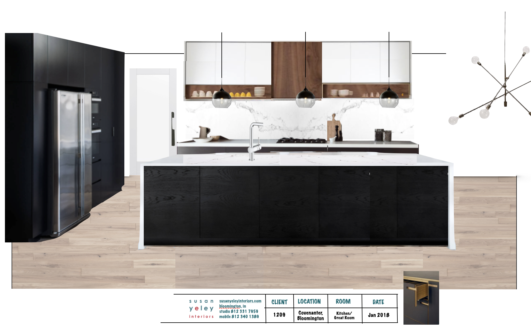
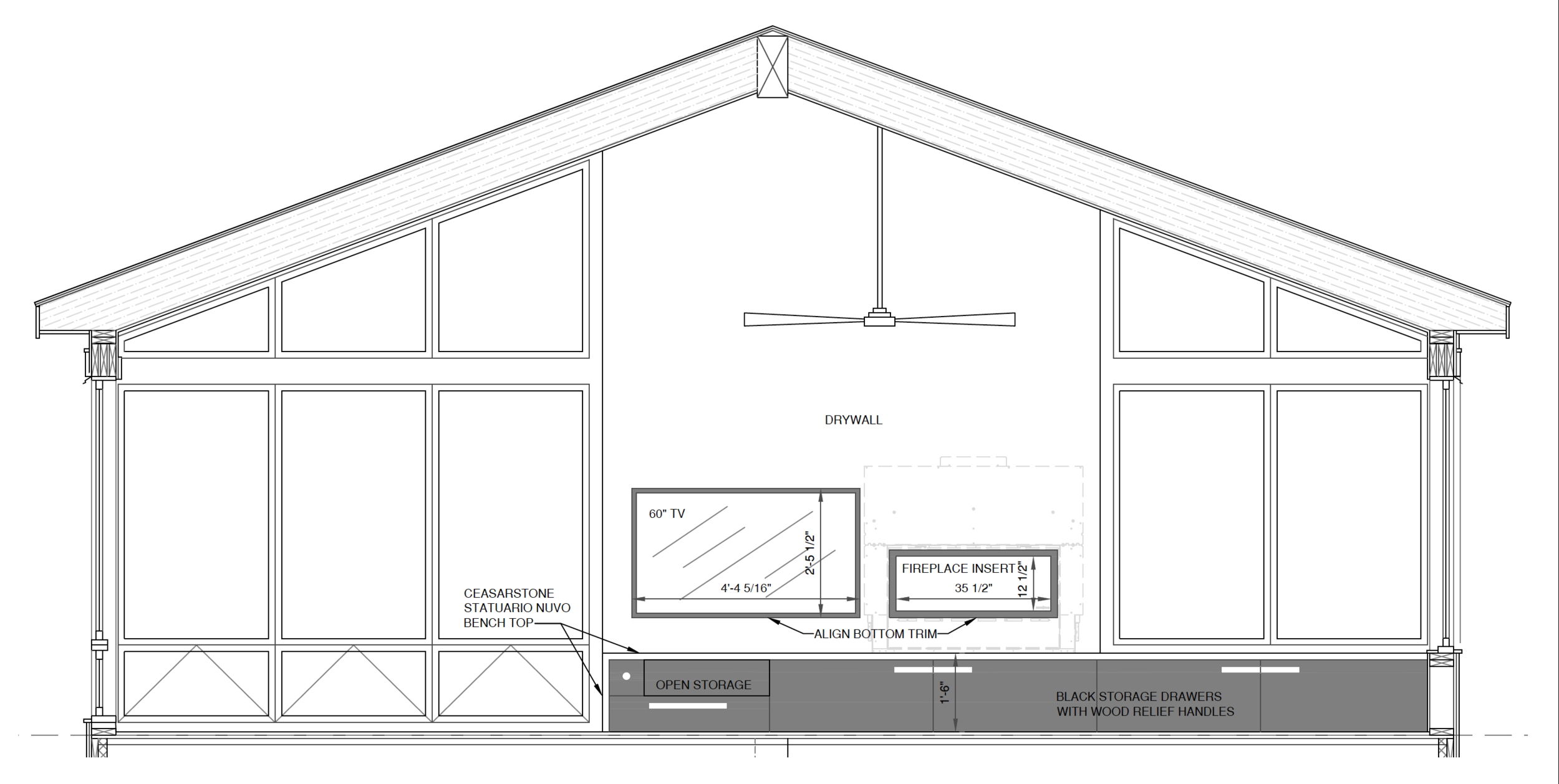
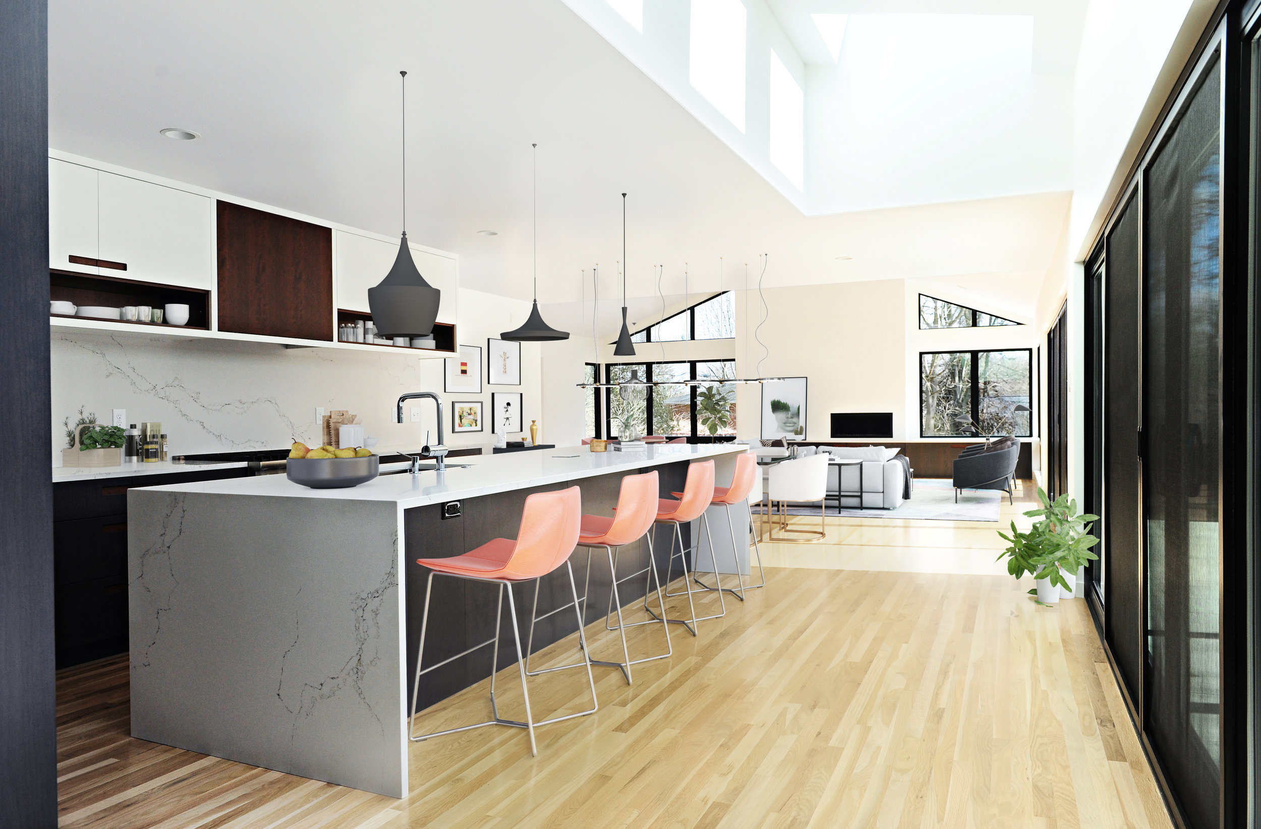
You’re standing at the end of the front hall built-in. Doesn’t it make you wanna sing? All that light and contrast and air. Honestly it’s just how we pictured it—from inspiration to image board to CAD drawing.
An Ode to Virtual Staging
The thing was, however, we weren’t hired to decorate this beautiful home. It was a spec home, remember? No owner for whom to select sofas and rugs and art. But no home is complete without the stuff that fills it: the stuff that means something to the people who live there. We can stage bathrooms and mudrooms for photography, but great rooms this great need more than some plants and hand towels and wellies to give you the whole effect.
To be sure, the home was staged when it went on the market. It was gorgeous and totally helped sell the home, and we made a new friend in Diana Paxton who filled it up with such care and talent. But we do interior design. We believe that it isn’t enough to build a beautiful box; you must fill it with thoughtful pieces that reinforce the architectural elements, as well as your own lifestyle. We neither wanted to claim Diana’s lovely work as ours nor did we want to show this home in our portfolio empty.
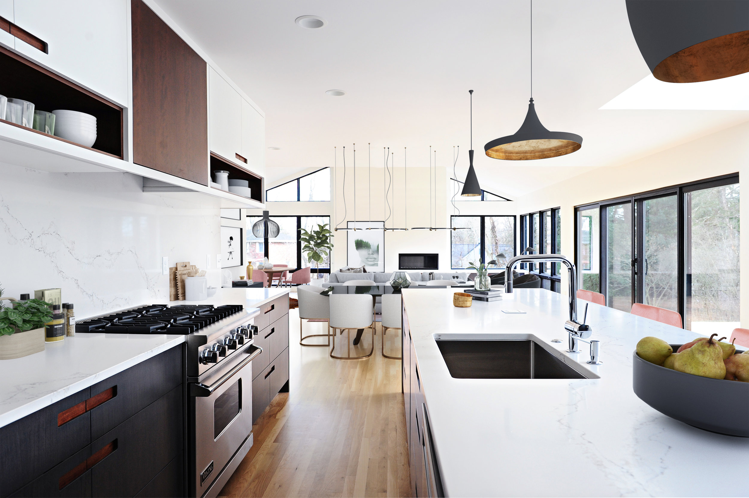
Enter our favorite new thing: Virtual Staging. Would you ever put dry clean only velvet on your dining chairs? Have a glass coffee table with three kids and a labradoodle? Put a cow hide under a game table so it gets under your chair legs every time you push them in? Nope. Neither would we. But we didn’t! Not in the real world! Just in this beautiful fake world that we created inside our Mullet Ranch. There’s nothing not fun about designing in a complete reality vacuum.
Virtual staging is gentle on the wallet and soul. No budget. No movers. No need for a truck or storage unit or people to help move all the stuff. No touch ups. No need for extra insurance. No back breaking labor. We used a great firm that allowed us to go through their catalogs and pick everything out.
Virtual staging can’t always replace real-life staging. Real-life staging can absolutely sell property—especially a home that is a tough sell or that needs to be depersonalized so that any buyer can picture herself living there.
But for us, for this purpose, we figured what the heck.
Not bad at all, we say.
The home sold this winter. Who knows what the owners will bring into it. Whatever the furniture and accessories, we are sure it will be filled with the most important things: memories and loved ones—just like it was when the folks lived in the original ranch. We wish them—the former owners and the future ones—well.


